I moved! Check me out at circa1932.com

Quick PSA for y’all – Thanks to fantastic Black friday pricing, I made the leap and bought my own domain name.  I won’t be posting here anymore, but I hope you’ll make the jump with me over to my new home at circa1932.com. Also, if you subscribed via e-mail before, you’ll need to re-subscribe at the new site as well if you want notification of new posts and such.  Thanks so much, and hope to see you over on the new site!

-Sarah

Gilding the Pumpkin

Earlier this week, when I shared our fall mantle with you, I promised a tutorial on the gold pumpkins that I used.  To be honest, I feel a little silly even calling this a tutorial – I am pretty confident that y’all can figure out how to get the look without my help!  Still, I’m not about to go back on my word, so here’s a quick rundown on what I did to turn plain-jane foam pumpkins into these golden beauties!

DIY gold pumpkins

I know, I know…gold is everywhere.  It seems everywhere I look – in stores, online, on Pinterest, etc.  gold is going strong as the metallic du jour.  Honestly though, I’m not complaining – I have jumped wholeheartedly on that bandwagon.  As much as I love stainless and silver, nothing warms up a space quite like a touch of gold.  Plus, it goes so well with the colors of the season.  From russet, to crimson, to goldenrod, to chocolate – gold sets them off in such perfect harmony.

So for my mantle this fall, I decided the only thing better than pumpkins would be GOLD pumpkins. Well, sort of – I didn’t use real gold (on a budget over here, remember?), but I did use the next best thing – liquid leaf.  As for the pumpkins, I got them at Target after Halloween when everything was marked down 70%.  You can also buy them at craft stores, Big Lots, Dollar tree. or through the affiliate link above.

Now as an official fangirl of everything golden, I have alot of products in my arsenal that can give something the Midas touch.  Someday, I’ll do a big, fat, comparison post of them all so you can see the differences.  I love my gold spray paint and my Rub ‘n Buff, but when I want something to really shine, I turn to liquid leaf (similar, in classic gold).  Yes, it’s smelly (it’s oil-based).  Yes, it’s expensive compared to, say, gold craft paint.  But the shine – oh baby…the only thing that compares (other than the real deal, of course) is gold leaf sheets, which make such a mess that I only use them when I absolutely must.

Liquid leaf comes in a bunch of colors, from silver to copper, but for this project I used the color “brass.”  It’s gold without being too orange – it has just enough green in it to avoid looking like pyrite.  While this product can be used anywhere you would use normal paint, I find it is shiniest and most metallic when used on smooth, non-porous surfaces, like polymer clay or plastic.  In this case, I was painting over some dense foam pumpkins that had been sealed, so the surface was perfect for liquid leaf.  I just used a craft brush to paint a coat of liquid leaf over the pumpkin – no primer.  On most of them, I found I only needed one coat, as the product if very opaque and a little goes a long way.  Make sure you shake the paint well though – the metallic flakes in it tend to settle to the bottom, so if you don’t shake it it will come out streaky and transparent.  Here’s what my ugly duckling pumpkins pretty much looked like before:

foam pumpkins unpainted

SUCH a realistic color and pattern, don’t you think? Yeah…not so cute.

And with one coat of liquid leaf:

one coat of liquid leaf

Ahhhhh….much better!

I did find that the liquid leaf picked up some warmth from the base color of the pumpkins.  So, the pumpkins that started out white were more of a true brass tone, while the orange pumpkins (like the one in the picture above) took on a warmer, golden hue.

After I got everything painted, I could have easily called it a day – they were beautiful just as they were.  But if you’ve read any of my previous posts, you know I have a bit of a hard time leaving well enough alone.  So, to add some additional color variation and depth, I went back in with some of Viva’s Inka-Gold in “old silver” and rubbed it into the high points of the pumpkin.

What is Inka-Gold, you might ask?  Well, if you’re familiar with Rub ‘n Buff, it’s very similar.  Basically, it’s pigment suspended in a soft, waxy base that you can rub onto surfaces to deposit color.  Once it has set, you can buff it with a cloth, which shines up the wax and makes the pigment more brilliant.  Though I love my liquid leaf, it can be a bit shiny for my tastes.  By adding the Inka-gold over the top, it softens down that shininess so it’s more of a satin/glowy finish.  Depending on what color you use, it will also change the hue of the paint underneath.  Here is a comparison shot so you can see what I mean:

comparison shot of liquid leaf and inka gold

liquid leaf on the left, liquid leaf + “white gold” inka-gold on the right

It’s hard to see in the photograph, but the pumpkin on the right is significantly less shiny than the one on the left – it’s still metallic and reflective, but softer.  One other big advantage of Inka-Gold over Rub ‘n Buff is that it is water-based, which means you can thin it with water to make it more of a paint consistency, and  it cleans up super easily from both your hands and your project with regular soap and water.  If you over apply, all it takes to remove it is a damp cloth!  Rub n Buff is great, but it is hard to wash off and it is oil-based which means cleaning up with mineral spirits.

Here’s another shot of the completed pumpkin closer up so you can see the color and sheen variation:

pumpkin closeup

And one of them on our mantle, so you can see them in context:

DIY fall mantle with gold pumpkins and bookcase wreath

I didn’t seal these, but if you wanted to give them a quick shot of clear gloss I am sure you could .  I was a little nervous that the aerosol would melt the styrofoam pumpkins though, so I decided not to risk it.

So, to sum up:

1) Get foam pumpkins

2) Paint foam pumpkins with liquid leaf of choice

3) Optionally, apply Inka-Gold or Rub ‘n Buff to add dimension

4) Do a happy dance – your pumpkins are done!

Let me know if you try it, and feel free as always to leave comments or hit me up on social media – I’m on instagram, twitter, and facebook!

Till next time,

Sarah

Layered Fall Hurricanes

Out of all the DIY projects I did for the fall mantle, I think these may be my favorite.  Don’t get me wrong, I love a gilded pumpkin and a book wreath as much as the next gal, but I can’t get over how much impact these have and how easy they were to do.  I am pretty sure y’all could figure these out just by taking a peek at the pictures, but I thought I would go ahead and whip up a tutorial for you anyway.  What can I say?  I’m a giver.

Now for those of you who may have missed the original peek at these beauties, here is a glamour shot so you can see what I am talking about.  If you want to read more about the mantle as a whole, feel free to check out the original post here).

fall mantle angle

Want to make some of your own?  Let’s get started.  First up, supplies!

DCF 1.0

Not pictured: white rice and ribbon for bow Also, pretend the curly branches are actually the straight ones I ended up using – it was a last minute substitution and I had already taken the supplies photo! #gametimedecision #keepinitreal


You’ll need:

-glass containers at least 10″ tall: mine came from the Homegoods clearance aisle – 8 bucks apiece!
-various fall colored fillers: I used uncooked brown rice, white rice, green lentils, and red pinto beans from the grocery store (Tip: check the international aisles for the best prices!).
-branches or twigs: mine were from Walmart many many moons ago.
-accent greenery: I have had these gold curly-q branches for so long I don’t remember where I got them specifically, but I have seen them all over – craft stores, big lots, even Dollar Tree!
-small glass or plastic container large enough to accomodate a LED tealight
LED tealight (much safer and more convenient than an open flame!)
-ribbon for a bow (optional)

Step 1: Clean your glass!  I know this isn’t the most glamorous step, but nothing is worse than getting all finished with your hurricane and seeing a smudge that you can’t get to because your layered filler is in the way.  Go ahead and remove any stickers and gunk and make those containers sparkle!

Step 2: Fill each container  with at least 3″ of filler (4 or 5 inches is even better).  I like rice for this, because its shape and density allow it to sort of “lock” together, forming a stable base to hold your branches in position.  If you are using shorter branches, you can get away with less than 3 inches, but I wouldn’t recommend it as a general rule.  I used both brown and white rice to form my 3″ base, because I didn’t have enough brown rice on its own.

Step 3: Add your branches.  Try to place them in a sort of ring on the outside edges, so that the center is clear.  The open space is only important at the top, since we’re going to bury our votive holder there and it will need some room.  The branches can go into the center towards the bottom (under the votive) if that makes sense.  Hopefully my picture will explain this better than I seem to be able to in words!

I placed my foundation (non-glitter) branches first, and then filled in with the gold curly-q accents.  If you are making a pair, to flank a mantle let’s say, try and keep them visually balanced.  They don’t have to match 100% (in fact it’s better if they don’t), but they should look related.  Think sisters, not twins ;).

DCF 1.0

Step 4: Add your next layer of fill, using your hands or a small instrument (I used a dinner fork) to make sure it lays evenly around the branches.  Repeat this with your final layer of fill, reserving a small amount for step 6.

DCF 1.0

Step 5: Grab your votive holder (I used a small tupperware meant for salad dressing) and place it in the middle of the glass container, inside the branches.  Now gently push down and wiggle it around, nesting it as much as you can into the top layer of fill without messing up the layers.  Most likely, you will have a small rim showing – that’s okay!

Step 6: Take the fill you reserved in step 4, and add it carefully, hiding any rim you might have left showing previously.

DCF 1.0


DCF 1.0

Step 7: Add your LED tealight to the votive holder, tie a bow on the hurricane, and step back to admire your work – you’re done!

pardon the poor lighting - it's a glum rainy day!

pardon the poor lighting – it’s a glum rainy day!


See?  Super easy.  All in all, these took me about 15 minutes apiece, and cost me less than $10 each.  All I had to do was raid my pantry for uncooked legumes and grain!  Other options for filler would be black beans, popcorn, or even fresh cranberries.  There are so many options, so you can change this up for virtually any season or color scheme.  Think fake snow, glitter, and jingle bells for winter, or colored sand for summer.  The possibilities are only limited by the size of your vase and your imagination.

A note on the LED tealights: these are the ones I use, and I really do like them.  First of all, they have a timer, people.  Once you flip them on, they stay on for 6 hours, and then they turn themselves off for the next 18.  I can’t tell you how convenient that is – no fishing the tealight out of the hurricane, no forgetting to turn them on or off, just pretty glowing light that comes on like magic.  Second, they flicker, so the light is pretty realistic looking.  Third, they give off a really bright white light.  So many of the LED flameless candles on the market are incredibly fake looking and orange, but these glow a very clean white.  If I want a slightly warmer tone, I just color the silicone bulb in a bit with a pale gold permanent marker (this one is my favorite – I use the burnt ochre color, but a yellow sharpie also works well).  For a more detailed post on that, click HERE.

So that’s it!  Be sure to comment if you have any questions, and come back later this week for tutorials on the book wreath, the luminaries, and the gold pumpkins.

Till next time,

Sarah

FYI: this post contains affiliate links – this means that if you buy something through one of the links included here, I might make a (teeny tiny) commission. This commission has absolutely NO IMPACT on the price you pay (it would be the same price if you found it on your own) – it merely is a thank-you from the seller to me for directing you to their product!


Bubble, Bubble, Toil and Trouble – A (Belated) Halloween Potion Bottles Tutorial

Today’s post is brought to you by the following poem:

There once was a very bad blogger,
who found Halloween was upon her.
She’d promised to write
About potions of fright
But her camera said the pics were a goner!

Ok, cheesy, I know. I won’t quit my day job. In all seriousness though, I know I promised a picture-laden tutorial on the potion bottles I showed you in the Halloween reveal post (catch that here if you missed it the first go round!). Unfortunately, when I went to write the post on Halloween, I discovered that my camera malfunctioned, and I lost ALL the pictures I took of the process. At first I was going to chalk it up to bad luck, and just skip the post entirely, but my inner Jiminy Cricket kept whispering “a promise is a promise.” So, here it is – a very text-heavy tutorial on the Halloween potions. I am really truly sorry this is so frightfully (Haha. Halloween. See what I did there?) overdue and I’ll try my best to make sure it doesn’t happen again. Luckily for me, Halloween comes around every year, so maybe you can use these next year!

Now that I have my groveling out of the way, lets take a closer look at those potion bottles! You might have caught a glimpse of them here, but I wanted to go a bit more in-depth and share a quick rundown of how I made them. I have been seeing similar projects all over Pinterest lately, and I just knew I had to put my own twist on them. The idea of creating all those lovely labels just spoke to my inner graphic design nerd. What can I say – finding the perfect font, kerning the characters juuuuusssst right, and laying it all out in a pretty vector frame just sets my li’l ol’ heart a-flutter. Of course, the fact that this project gave me a perfect the opportunity to dust off my inner geek and incorporate all sorts of Harry Potter references didn’t hurt either!

Here are some glamour shots of the potion and ingredient bottles all completed to refresh your memory – keep reading for a (picture-less…boo) tutorial and a printable of all the labels I used (since I know not everyone wants to typeset them from scratch, lol).

halloween mantle spells

halloween bar potion ingredients

TUTORIAL – warning: this is long and detailed…I write tutorials the way I would want to read them and in my experience the more detail, the better! Normally, I would break this up with pictures buuuut #technicaldifficulties.

The very first thing I did was start saving bottles and jars. I did end up buying a few at the thrift store and Joann’s Fabrics (similar here), but for the most part I had the bottles laying around my house. Try and get a variety of heights and sizes – it will help make your completed vignette more balanced and interesting. Also try and save some corks if you can – if not you can buy some from the craft store, but free is always better in my book (note: I am not technically advising you to drink wine in order to complete this project, but it does seem a valid method of obtaining corks!). Make sure to thoroughly remove the labels and clean the bottles thoroughly inside and out before you begin brewing your potions.

After I had my bottles collected, I sat down at my computer to create a list of potions/ingredients I wanted to make. I drew on a variety of sources for this – Harry Potter books, movies, Shakespeare plays, fantasy novels I have read over the years, pop culture, other bloggers – this is one of the most fun parts of the process, so take your time. As you list out your items, try and think of something that you could put in the jar to represent that item and make a note of it. For example, I knew I wanted to use dried mushrooms for “Boomslang skin” so I noted that on my list. Keep in mind that these bottles are likely going to sit out at room temperature for at least this year (and possibly more, if you keep them for your decor next year), so try and put things in them that you know will be shelf-stable. We don’t want anything rotting away or getting moldy – that could be a health hazard! Also, if you have small children, try and only use ingredients that can’t harm them if they get into it – although I felt perfectly fine putting cayenne pepper in my “fire salts” mixture, I wouldn’t have done so if I had kiddos. Same goes for the mini liquor bottles I used for several potions. Safety first!

The next step is to match the bottles with the contents. Just use common sense – bulkier items like “Owlet’s wing” will need a bigger jar, while rarer potions would be kept in a smaller jar to reflect their special and limited status. Some of this boiled down to economics – for my “beetle eyes,” I knew I would be buying iridescent seed beads. There was no reason to put them in a humongous jar – that would just mean more beads for me to buy! Common sense, kids – it’s a good thing.

Next up – print the labels, cut them out, and make them look old. Click the link at the bottom of the post to download the labels I used, or feel free to create your own. There are also several other bloggers who have done labels and offered them as printables if neither of those options appeals to you. I printed mine on parchment to give them a head start on looking old – this is similar to the one I used, but any ivory paper will work just fine.

To cut mine out, I used the print and cut feature on my Silhouette Cameo, but it could easily be done with regular old scissors – it would just take more time and patience than I typically have, lol. As for aging the labels, I used Distress Ink in two colors – “tea stained” and “old paper.” You can find it at most craft stores – I got mine at Joann’s and used a sponge dabber (the kind you use for stencils) to buff it randomly into the paper. After all the labels were inked, I crumpled them up and smoothed them back out again to make them look even more decrepit.

With my list and labels made and my bottles obtained it was time to begin the process of modifying my bottles, adhering my labels, and filling my containers. I didn’t paint any of my bottles, but if you want to now is the time. Same goes for etching them to make them opaque or sanding them to distress them. For the most part I left my containers clear – a few of them I did fill with smoke to make them darker and more creepy looking. Check out this tutorial for how I did that.

If you choose to add smoke to the bottles, a few tips/words of caution. The rim of the bottle will get really really hot. Also, only do this with glass bottles. I am sure none of you would be silly enough to try with plastic, but it should be said nonetheless :). Finally, make sure you are using the right kind of candle – soy candles burn too clean and don’t give off enough smoke. What you want is a regular old cheap candle, or – even better – one with a real wooden wick. The smokier and sootier the candle burns, the faster the glass will darken and the better it will look.

Adhering the labels was a cinch. To make things easy, I used my Xyron sticker gizmo for the smaller labels and double sided tape for the bigger ones – no waiting for glue to dry! A few of the tags I wanted to tie onto the bottle, so I just left those aside for the moment and tied them on once the bottles were filled.

Still with me? On to the actual filling! You’ve done your research, you have your list, your bottles are labeled and ready, and now all you have to do is fill the containers.Be creative and use what you have. Colored water makes a great potion, as does colored corn syrup with glitter added in. Look around your yard too – wind-dried weeds can easily become “mandrake root” or “knotgrass.” Pea gravel can double as “bezoar.” Don’t forget your pantry!! I used oil-packed sun dried tomatoes as “toad spleen,” and creamed honey could easily be mistaken for “bubotuber pus.” For “owlet’s wing” I used feathers, and for (albino) “wool of bat” I used fake spider webbing from the dollar store. The sky is the limit – just use your imagination! If you really can’t think of something to put in the bottle, then leave it empty – just spray paint the bottle or sand it so it’s opaque and no-one will be the wiser. If the idea of someone picking it up and realizing it is too light/empty bothers you (or maybe I’m the only one neurotic enough for that to bother), put some plain water or some rice in it to give it some weight.

You’re almost done! All you have to do now is seal the containers. For the bottles, I mostly just put a cork in it and tied the neck with some twine or ribbon to give it a little something extra. The jars were a little more challenging, since they were printed and colorful with their original advertising on them. At first, I was going to mod-podge them with brown paper and distress it to look like parchment. After doing that on one though, I decided that method took too long – I am not a patient woman, and waiting for glue to dry was not something I wanted to do. Rummaging around in my craft studio yielded the perfect solution though. First I covered the lid with small torn up pieces of regular beige masking tape to mimic the look of old paper and cover up the advertising. Then, I distressed them with the same ink I used on the labels to make them look dusty and old. Finally, I layered some fabric netting I got on clearance last year after Halloween over the tops and tied the whole thing up with leather cord and ribbon. This is similar to the fabric I used. The final step was creating the look of wax dripping down the bottles. A little strategically placed hot glue proved the perfect solution. After it dried completely, I took acrylic paint and painted over it to color it red, black, or gold. For the gold I actually used the same sharpie markers I drew on my walls with here.

You’re done! Stand back and admire your work, ladies and gents. If you want to me juuuust like me, you can squeal a little and hop around the room clapping with childish delight, but this is completely optional. I chose to split the bottles up into two groupings – one for the mantle and one on a thrifted silver tray in the dining room. Of course, you don’t have to make nearly as many as I did – I got a bit carried away. Three or four would be perfectly sufficient, and would take much less time to do with the same exact effect. Make sure to comment if you have any questions, and let me know if you try it out – I’d love to see your handiwork! Also, come back tomorrow for another (3 days in a row! woo!) tutorial on the fall mantle hurricanes.

Till next time,

Sarah

Download your free Halloween printable here!

labels

Creative Commons License
Halloween Potion Labels by Circa1932 is licensed under a Creative Commons Attribution-NonCommercial-NoDerivatives 4.0 International License.

*Legal Stuff (boring, but necessary): This work product is only to be used for personal, non-commercial applications, and is protected under an Attribution-NonCommercial-NoDerivatives 4.0 International creative commons license. Please do not appropriate this work for commercial use or publish this work as original content on any blog, website, social media outlet, or any other avenue without first contacting Circa 1932 and receiving written permission to do so. Any links to this content should be to the original post on circa1932.wordpress.com rather than to the content itself hosted on another medium.

**this post contains affiliate links – this means that if you buy something through one of the links included here, I might make a (teeny tiny) commission. This commission has absolutely NO IMPACT on the price you pay (it would be the same price if you found it on your own) – it merely is a thank-you from the seller to me for directing you to their product!

Happy Fall, Y’all!!

Well, fall is officially here.  Everywhere I look, mother nature is putting on a show, workin’ it in shades of crimson, gold, and orange.  This is one of my favorite times of the year – I count down the days will the sky is that perfect crisp blue and there are piles of leaves to kick and play in on my walks with the fuzz (her real name is Isabelle, but we almost never call her that, haha!).  Even on days like today, when it’s rainy and glum outside, I love to curl up under a blanket with a cup of coffee, a fire, and a good book – it just feels right somehow.

Of course, today I am tackling the mountain of laundry (seriously, it’s taller than me) piled up in my guest room, so no coffee-and-blanket-pottery-barn-fantasies for me.  However, though I may have to tackle laundry in my real life, in the blog world I can pretend I get to spend all day looking at the mantle all decked out for fall.  And while I’m pretending, I might as well imagine I am sharing both the fire and a cup of coffee with a friend.  So come and join me – would you like one sugar or two?

If you follow me on Instagram or Twitter (follow the links to do so if you haven’t already!), then you caught a sneak peek last week, but here’s the full reveal for you.  I will be posting tutorials (with photos – I remembered this time!) for the gilded pumpkins, the wreath and the glass hurricanes later this week and early next, so make sure to come back for those as well.

Here she is – isn’t she a beauty?

DIY fall mantle

pardon the poor lighting – it’s a glum day!


As usual, there were several DIY projects.  The wreath, gilded pumpkins, luminaries, and hurricanes were all little projects I did specifically for this season.  As usual, I included a mirror behind the wreath – it just helps to open up the room and add depth to the whole look.  Someday, I am going to do something with that wall over the fireplace, but I haven’t decided exactly what yet, so it will have to wait.  It is especially pretty at night – the luminaries glow and there is a flameless candle in each hurricane as well.

Here a few more pictures:

DIY fall mantle with gold pumpkins and bookcase wreath

DIY gold pumpkins

fall bookpage wreath DIY

Overall, I am happy with how things came out.  Plus, the whole project cost me less than $20.00!  Can’t beat that.

Till next time,

Sarah

Something Wicked This Way Comes…Halloween Mega-post, Circa1932-style

NOTE: I was originally going to break Halloween into several posts, but I got behind on my picture editing (oops!).  Considering Halloween is, well, tomorrow, I almost decided to forgo doing any Halloween posts, since odds are y’all have already finished your decorating.  However, I decided “better late than never” – after all, Halloween will be back next year!  So instead of a bunch of smaller posts – here is one big fat Halloween mega-post for your enjoyment.  It’s pretty long – you have been warned.  As always, feel free to comment and ask questions, and Happy Halloween!

I don’t know what it’s like where y’all live, but in my neck of the woods there’s a crispness is in the air and the leaves are changing.  Fall is HERE and I couldn’t be happier to see it arrive. Ask anyone who knows me and they will tell you I am a cold-weather girl.  Fall is my favorite season, followed closely by winter.  Sweaters and boots, comfort foods like soup and chili, pumpkin-spice everything – I tell you, it’s enough to make a girl grin from ear to ear.

Well, this girl is grinning extra wide because the changing of the seasons also means bringing out new decor, and with Halloween being tomorrow (crazy, right?), the front door wreath, mantle, and dining room have undergone a spooky transformation.  As always, I was working my hardest to stick to a teeny tiny budget.  Luckily, both my creativity and Pin-spiration are free. So sit back, grab a cup of cider, and take a tour through Halloween decor, circa1932-style.

All told, I spent under fifty dollars on everything.  I have limited funds to decorate for holidays, and Christmas always gets the lion’s share since it’s my favorite, haha.  As far as theme/vibe, I’m not really into blood and guts when it comes to Halloween decor, so you won’t find a lot of that here.  Also missing are blatant references to demons, ghouls, and such – I try to keep things family-friendly in case friends with kiddos drop by.

Instead, I prefer to go with what I call “gothic chic” (with an admittedly healthy dose of Harry Potter).  This has a few advantages.  Mainly, I can find decor elements that work and yet still fall outside the traditional realm of Halloween decorations.  Because of this, I can not only use things I already own, but I can also feel confident knowing that many of the items I do buy can be reused at other times of the year.    I know that some people have inexhaustible storage space where they can keep shelves and shelves of things for one particular holiday or event (I’m lookin’ at you Mom!), but in my case storage is limited, and an item that multi-tasks is always welcome.

For the most part, I limited my color scheme to black and white with some metallic accents.  There’s the occasional pop of red or purple in there for a little fun, but it’s few and far between.  I’ve had it up for a few weeks now, and I have to say I couldn’t be happier – even the Doctor (who fails to share my zest for seasonal decorations despite my best efforts to convince him otherwise) made a point to tell me that he liked what I had done.  Win-win!

Ready?  Here we go!

As for the front porch, I kept this pretty minimal this year – a few pumpkins on the steps and this wreath to greet you when you come in.

halloween front door wreath

To create the wreath, I just wrapped a grapevine wreath form with black feather boas I got at the Dollar Tree.  I tucked the ends into the grapevine to secure them, so there’s not even any hot glue to mess with for this step.  I wired on a black crow, also from Dollar Tree, and plopped a miniature witch hat I got at Joann Fabrics on her head to add some flair.  A confession: to get the hat to stay, I pinned it in place with applique pins.  I just stuck it through the hat and into the crow’s styrofoam head – poor birdie!  Finally, I finished it off with black glitter ribbon and some fake flowers hot glued into place (from – you guessed it – Dollar Tree).  All in all, it cost me less than ten bucks for the supplies, and took about ten minutes to make.  If I were going to do it again, I’d probably spray the flowers black, but I’m pretty happy with it despite the purple.

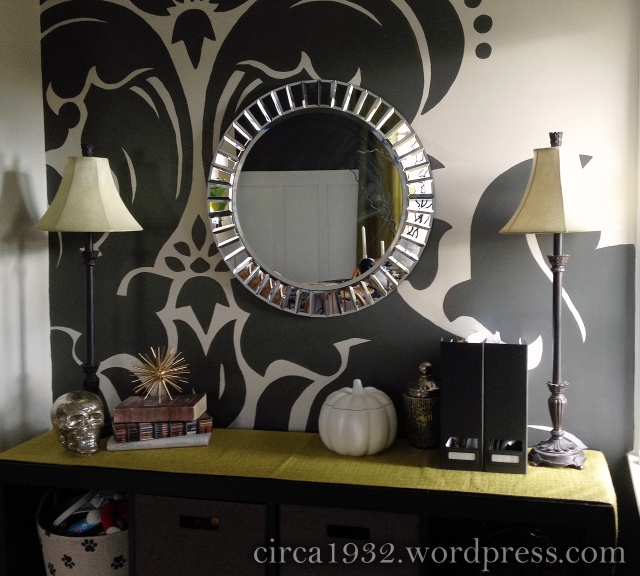
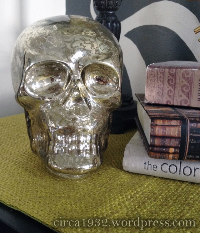
Once you get inside the house (welcome!), the first thing you see is my entry.  I kept this very cheap minimal as well.  I swapped out my owl vase for a mercury glass skull I got at Big Lots for eight bucks.  I also swapped the silver bowl that is usually on the buffet to hold our keys and phones for a white ceramic pumpkin.  It’s supposed to be a cookie jar I think, and I got it at Target for $7.99.  I love how neutral it is, and after Halloween is over I can use it in my fall decor.  I have plans for that ‘lil bugger, but you’ll have to wait and come back to see what they are!

halloween entry overview

halloween entry pumpkin

halloween entry skull

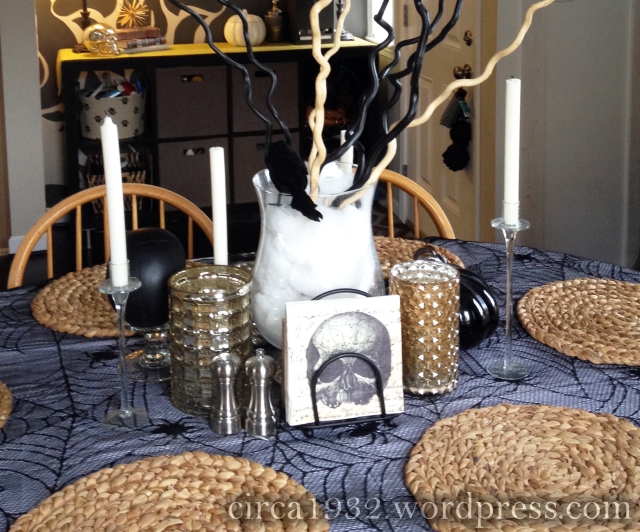
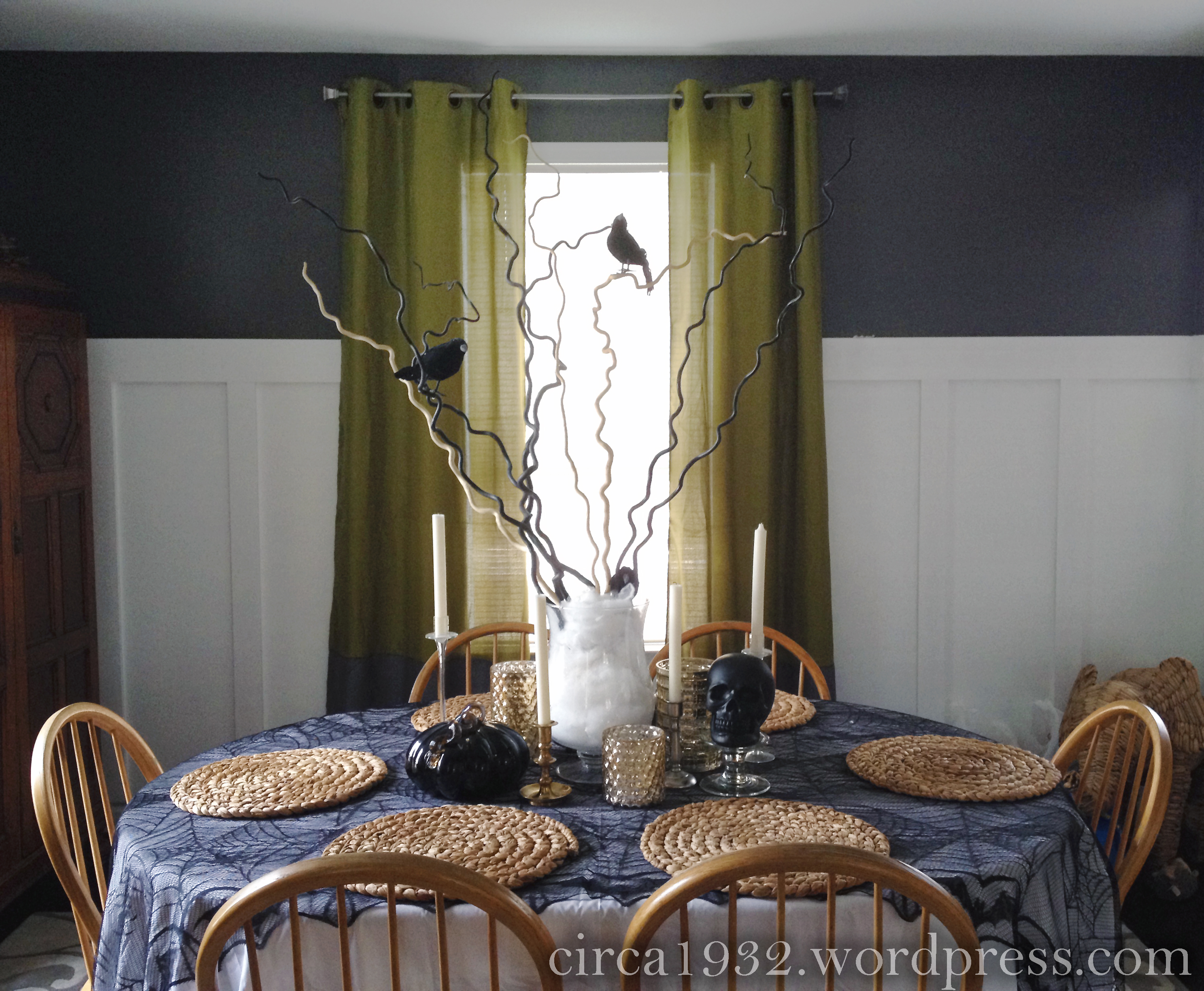
Moving into the dining room, the focus is all on the table.  See?

halloween tablescape overview


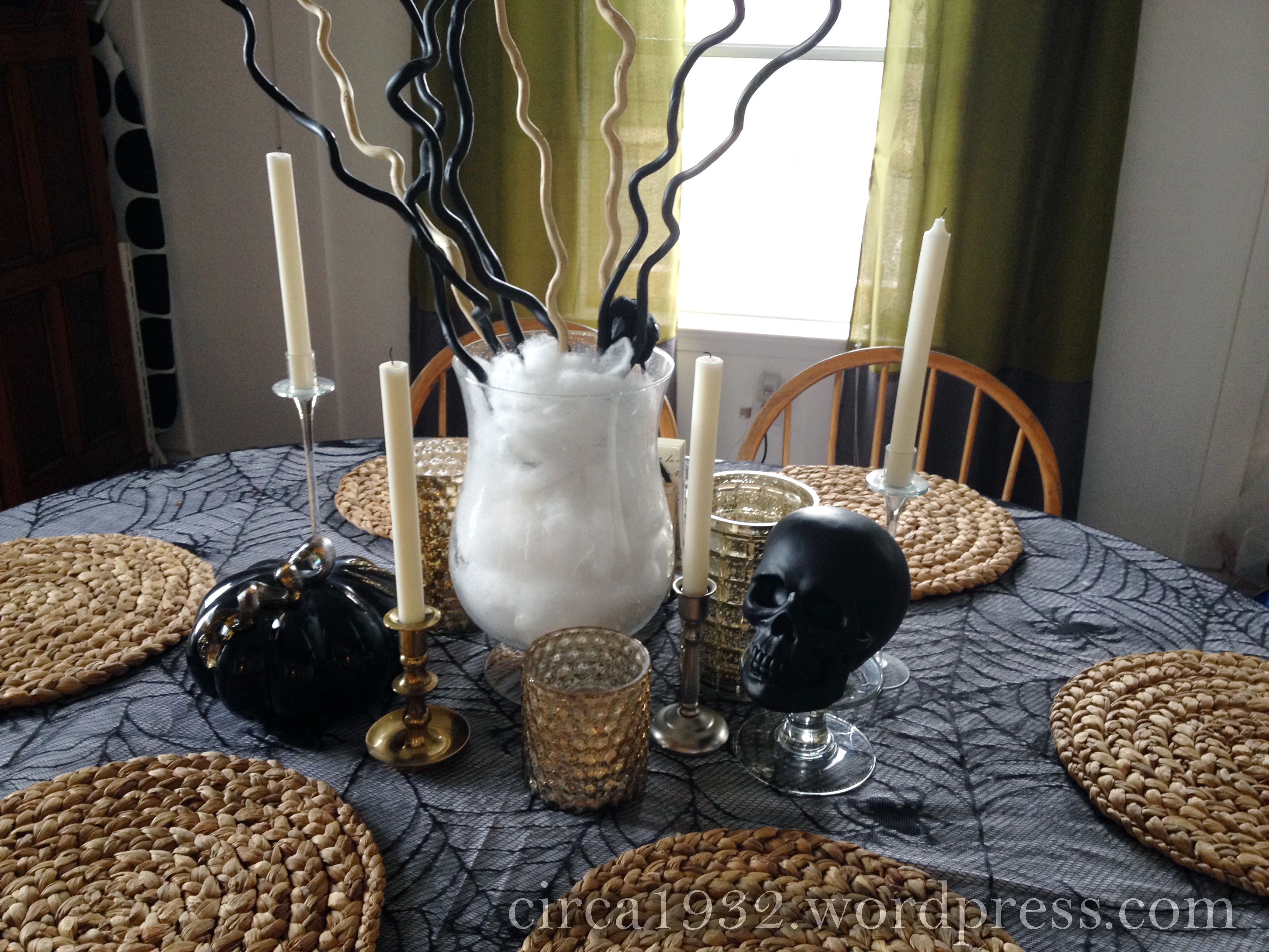
Here’s a closer look:

halloween tablescape mid

halloween tablescape skull

Hello there pretty bird!

Hello there pretty bird!

halloween tablescape back

The side facing the wall – even the napkins are getting into the Halloween spirit!

Here’s the skinny on the tablescape. I started with a white twin bedsheet (I think it was $5.00 at Walmart?) as the base.  Over that, I added a lacy black tablecloth that I got at a thrift store for around $6.00.  If you are looking for something similar, I saw some in Big Lots this year – they even came with an orange tablecloth as well (bonus!).

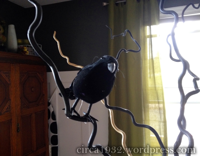
The central tree/branches came from Walmart. I got them many moons ago as part of an art project I did when I was in college (on second thought, better make that many MANY moons ago).  Originally they were all white, but I sprayed some of them black with spray paint to add some contrast.  Most of the year, they reside on my mantle in a vase, but for Halloween they made the perfect framework to perch some more dollar tree crows on (they are just wired on – no glue).

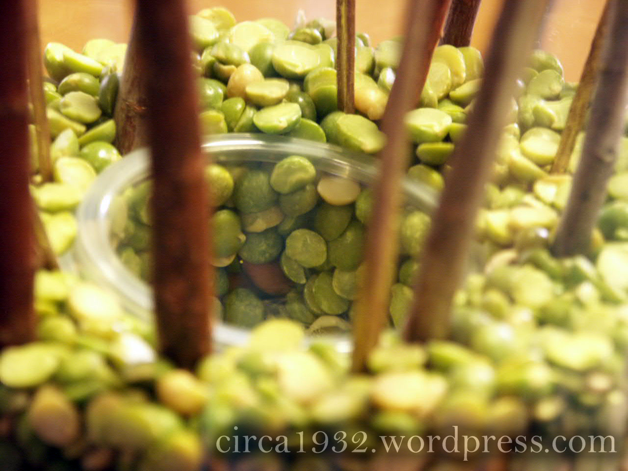
To get the branches to stay in place, I filled a smaller vase with uncooked rice (small pebbles, kitty litter, or beans would work too), and shoved carefully buried the branches in the rice until I was happy with the placement.  The rice weighs the “tree” down, and gives the branches stability.  Then I just put the smaller vase in my larger hurricane vase and filled in-between them with faux spider webbing to hide the interior vase and the rice.  Tip: the more you stretch the webbing out, the more realistic it looks.

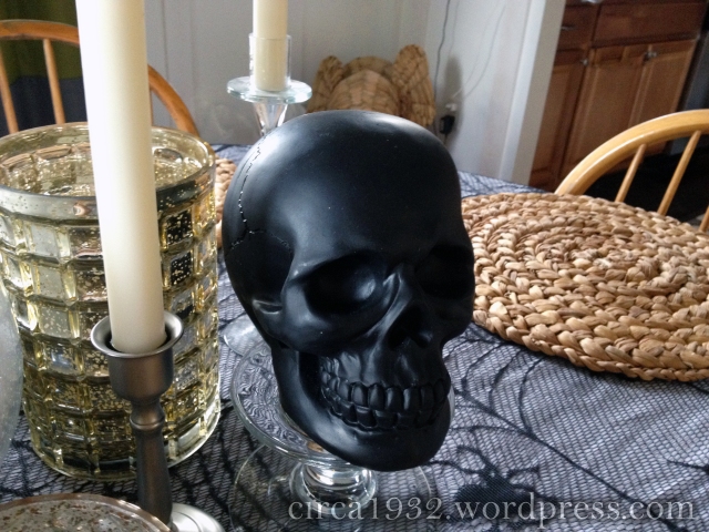
To finish it off, I added some gold mercury glass candle holders that I got at Target and Homegoods earlier this year, as well as a mixture of clear candlesticks and metal candlesticks from the thrift store.  A black glass pumpkin from Homegoods’ after Halloween markdowns last year and a chalkboard skull from Joann Fabrics ($5.00!) round out the centerpiece.

Since the only items I bought were the skull, the napkins, the crows, the spider webbing, and the tablecloth, I spent a grand total of $20 bucks for the tablescape.  Pretty snazzy, huh?

We’re almost done – all that’s left is the bar, and the mantle in the living room.

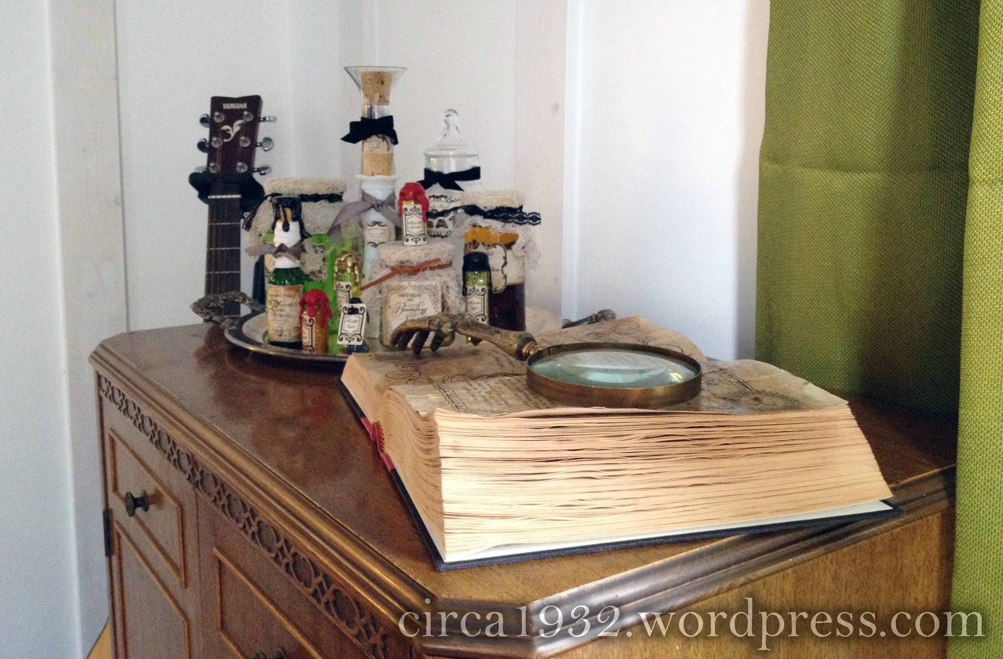
For the bar, I knew I wanted to make a spellbook and potion ingredients as a nod to one of my favorite series – Harry Potter.  Here’s what I came up with:

halloween bar overview

halloween bar spellbook

halloween bar potion ingredients

The spellbook is just an old book from the thrift store that I glued some new pages into.  I created them on my computer, printed them out, and then aged them with tea and distress ink.  To up the spook factor even more, I added a skeletal magnifying glass that I got at Homegoods several years ago.  I saw them there this year as well, so you should still be able to find them.  They come in the gold I bought as well as an aged silver color I believe.  The potion bottles were another DIY – I cobbled together a bunch of ideas I saw on Pinterest to create them.  I think I went a bit overboard with this particular project, but it was so much fun coming up with the labels and ingredients, I couldn’t stop myself!

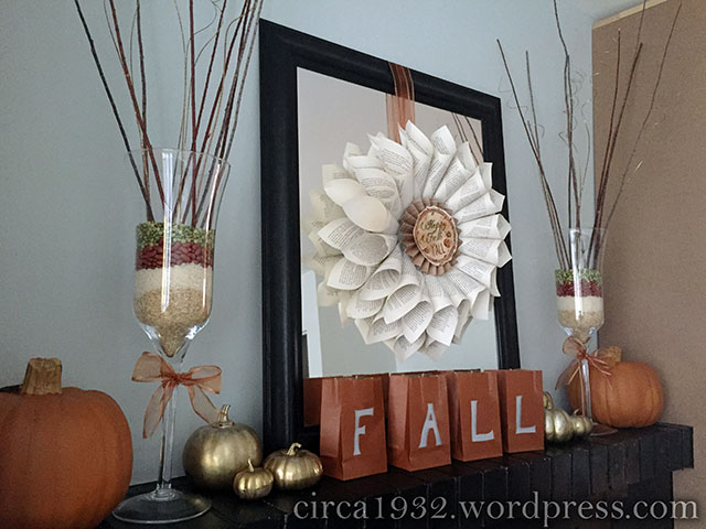
Last but not least is the mantle in the living room.  Here’s an overview shot (please ignore the unfinished built-ins):

halloween mantle overview

And a few close-ups for your viewing pleasure:

halloween mantle spells

halloween mantle crystal balls

As you can see, I added a crepe paper wreath over the mirror.  Go here to learn how to make your own.  I also hung up a Halloween banner I found at the Dollar Tree, and popped a spooky printable from A Night Owl into the frame where our wedding photo usually sits.  Finally, I added some more potion bottles and some creepy “crystal balls” (inspired by the fabulous Flamingo Toes) atop thrifted candlesticks.

So there you have it – the our little cottage all decked out for All Hallow’s Eve.  Make sure to come back tomorrow for the potion bottle tutorial, and feel free to ask questions or leave comments – it makes my day to hear from y’all!

Till next time,

Sarah

A girl and her sharpie – aka how I brought Cole & Son wallpaper into my budget :)

Hi again!  See, I told you I’d be back 🙂

So, when we last met, I introduced you to my Larry, my DIY fail.  I also mentioned that I had already redone the accent wall in the craft studio, so today is a reveal post/mini-tutorial.  If you guys want something more in-depth, let me know and I will elaborate with a full-blown tutorial for you.

Now, I don’t know about y’all, but I have a rather long-standing tradition of falling in love with design elements that are WAAAAAYYYY out of my budget.  As much as I love those design elements, I also kinda love a roof over my head, food on my table, and, um, my marriage.  All this means that I can’t blow my budget no matter how much I love a given table, rug, lamp, etc.  But ask anyone who knows me, and they will probably tell you I am stubborn determined (and resourceful).  Luckily, I am also not afraid to take risks with paint.  Here’s why:

cole and sons

source

Oh, Cole & Son, your wallpaper is so pretty, so my style, so…FRIGGIN’ SPENDY!  I first saw this wallpaper on Anthropologie (a website I only browse when my wallet is safely in the other room where I will be too lazy to fetch it), but at almost $200.00 a roll, it just wasn’t going to happen.  So, I decided to DIY it.  After looking on the internet, I found a bunch of birch tree stencils, but nixed these immediately since they didn’t really nail the original wallpaper. Plus, I thought it might hurt Larry’s feelings if I tossed him aside, only to do another stencil.  Y’all know I couldn’t risk that, haha.  Further searching led me to this post on Apartment Therapy, though, and I knew instantly that I was close to a solution.

marker tree

source

Finally, looking over my Pinterest boards, I found this pin of Vintage Revival’s gold sharpie wallpaper.

DIY Sharpie Wallpaper Tutorial @ Vintage Revivals[7]

source

Cue the lightbulb moment:  gold sharpie + hand drawn trees = the perfect solution to my craving for Cole & Son wallpaper.

And here it is!!  Pardon the less than ideal nighttime photos and the “storage unit chic” look this room is still rocking – it’s coming along, but it’s not done yet.

Fotor01014234557

Here’s a quick description of how I did it:

First, I pulled up a picture of the original wallpaper on my tablet so I could refer to it as I went.  This was super helpful in keeping the look uniform and preventing me from getting distracted and just doodling on my walls (not that that was EVER a concern…at all).

Next, I sketched out the tree and branch outlines very roughly in white chalk.  I also added in some knotholes.  I used the standard schoolhouse stuff that you can get at the dollar store and was perfect – not only did it show up really clearly on the navy walls, but it also came right off the with a damp sponge when I was done.

I then took the thinner of my two sharpie pens (I used both the medium and fine tip oil-based paint sharpies in the gold color), and drew roughly horizontal lines across the trunk of all my trees to fill them in.  I spaced these about 1/3″ apart on the main trees in the foreground, and wider on the skinny trees in the background.

Next, I took the heavier point sharpie (medium) and filled in between the lines with a combination of lines and dashes.  I tried to keep the pattern fairly regular between adjacent lines, but vary it overall so that nothing looked TOO uniform.

Finally, I used the fine point sharpie to add extra dashes on the one side of the tree trunks, to make them look more shaded and dimensional.  I also added some fine branches and leaves at this point, and added the Doctor’s and my initials in one of the knotholes for a personal touch.

All in all, I think I went through about 4 fine tip sharpies, and 3 medium tips.  I got all of them at Jo-Ann Fabrics, and used 40% off coupons, so all in all I spent around $15.00 for the whole wall, not including the navy paint.  If you add that in it’s probably more like $30.00.  Regardless, my DIY job was MUCH more in my budget that the $200.00 original. As an added bonus, I got to do it in my chosen color combo, and I kept the Doctor happy 🙂

So there you have it – the basic breakdown of what I did to create my own personal golden forest.  Feel free to comment with any questions you might have, and if enough people ask, I will do a full tutorial with pictures of each step and such.

Till next time,

Sarah

Meet Larry, a DIY fail

Hey there!  Remember me, the girl who hasn’t posted in, oh, forever?  Sorry about that, y’all.  Yes, life had been crazy.  No, that’s not really a good excuse.  I really am sorry for all three of you who have missed me (ha).

Moving on, let’s talk walls. The craft studio walls, specifically. Apparently, I’m on an accent wall kick at the moment (see here), so I couldn’t possibly just paint the craft room walls a single color and leave it (oh, the horror of making my life simple, right?)  No, I knew – I just KNEW – I wanted the far wall of the craft room to be an accent wall.  So, I decided to paint it navy.  This of course meant taping off trim, since such a dark color shows every friggin’ wavy line.  Have I mentioned how much I LOATHE taping?  If not, it’s alot – as in “I’d rather be cleaning my toilet – with a toothbrush” alot.  Yeah.

Anyway, I painted the wall, and it looked like this:

please pardon the mess...just keepin' it real people

please pardon the mess…just keepin’ it real people

Oooohhh….AAAhhhh….shiny, pristine, gorgeous navy wall – Bra-VO, past Sarah.  We’re done right?

Darn that past Sarah, she’s never content.  Apparently I drank the crazy Kool-aid that day, because I decided it needed more.  I wanted something with movement, something quirky, something modern, something GOLD, dangit!  So I turned where we all turn for inspiration, the internet.  That’s where I found this:

"Origami Crane" by DIYstencils

“Origami Crane” by DIYstencils

source

It was quirky, it had movement, it was modern, it (could be)  gold, and…it was cranes.  Now, there is nothing inherently wrong with cranes, I just have no real desire to put them all over my walls.  So I decided to design my own stencil (no problem, past Sarah said), cut out said stencil with my Silhouette Cameo (easy peasy, she said), and stencil it – perfectly aligned – on my very old, very cattywampus walls (I am beginning to lose faith in past Sarah’s judgment at this point).  Did I mention that there’s a window on this wall?  And that it isn’t completely level?  Yeah – sometimes I amaze myself with how brilliant I am.  Ugh.

Here’s the thing, though.  Once I get an idea in my head, I’m kinda like a dog with a bone.  I just can’t let it go.  So I decided to try.  Now, I have a particular love of elephants, so I decided to sub that in for the crane.  I found an origami line drawing of an elephant online, and used Adobe Photoshop and Illustrator to turn it into something my Silhouette could cut.  Here is the finished stencil (I used quilter’s plastic from Jo-Ann fabrics to cut it from).  Y’all, at this point I was SO EXCITED.  I couldn’t wait to try it on the wall.  Like this.  Ta-da!!!

DCF 1.0

And a close-up, because I’m nice that way…

elephants on parade!

elephants on parade!

It was right about this moment that I realized four important things:

1) it was going to take a LOT of math to make everything line up visually given the crooked walls and window – I am NOT a math person.
2) almost every remaining elephant on the wall was somehow going to be cut off by either the walls, ceiling, floor, or window frame.
3) My stencil didn’t want to bend around corners.
4) I didn’t want to cry.

So I decided to admit defeat, and go with something I can freehand (which is actually already done, so look for another post sometime around Tuesday – really, I promise).

So why am I even posting this?  Why put my failure out on the internet for all to see?  Well,  to demonstrate that we all make mistakes, and sometimes DIY fails happen.  But you know what?  That’s okay because we learn from it.  Plus, now I have a super cute elephant stencil that I already have great plans for.  I think I’ll name him “Larry.”

Till next time,

Sarah

Mood boards make me happy (a craft studio update)

Hey Y’all!  Hope your weekend was great – mine was wonderfully family-filled and I am sad to see it go.

I thought I’d start the week off by sharing my mood board for the craft studio.  After a floor plan, this is my next major step in planning out a space.  It may seem a little silly, or even tedious, but it is a really easy way to make sure that your colors and key pieces are heading in the direction you want.  Sometimes I will shoot pictures of the walls and do a full Photoshop rendering (I did with the master bedroom – to be featured at a later date), but that is not always necessary.  Especially if the room you are doing happens to be a disaster zone and shooting pictures of blank walls is pretty much a pipe dream.

I think of mood boards as an ultra-focused pinterest board – a place where you put all your ideas together so you can look at them as a whole and make sure they all work together.  In fact, if you don’t want to muck around with photoshop, you can do just that – make a pinterest board just for your room, and pin away!  The only catch is that it helps to be very selective in your pins if you take this approach.  For example, if you were doing a bedroom, only pin one bed.  Make sure that bed is one you a) love and b) can actually find (or at least get close) and put in the space.  Pinning 8 beds doesn’t really help – it is better to pin one bed, one dresser, one wall color, etc. so you can see the room at a glance as close to its final form as possible.

That being said, I generally stick to Photoshop, because it is familiar to me and because I can make the background my wall color and/or rug.  Doing this really helps me make sure every accessory and piece of furniture works with those two anchoring factors, which helps assure me that the final product will be harmonious.

For the craft studio, I decided to go with a neutral light gray-blue on the walls.  Specifically, Valspar’s “Seashore Fog.”  I originally planned to paint the walls a deep navy, but have since moved that idea to the master bedroom.  Frankly, this makes more sense since the master is ginormous and the craft studio is the size of a shoebox.  Additionally, I am a big enough girl to admit that I chickened out – what can I say, I was nervous about defying the old rule of small space = light walls.  Sometimes (usually) taking a risk is worth it, but I think the light walls will really make the room feel bigger, and I will just use the navy in smaller doses.  I am still toying with doing a navy accent wall or ceiling…you’ll just have to wait for the reveal to see what I choose!

I also chose to go neutral for the rug in the studio – gray and ivory.  One, because it was on sale (and y’all know the Doctor and I love saving money), and two, because this way I can change the accent colors in the room without being bound by the flooring color.  I tend to get bored with things after a year or so, so rather than fight that I try to make sure the foundation (ie, bigger or more expensive pieces) of the room are something I know will work with a variety of colors and design styles.  The Doctor doesn’t mind me changing up the pillows or picture frames in a space every once in awhile, but if I tried to replace all the rugs and furniture in our house on an annual basis he might not be so happy!

Other things to consider placing on the board are major pieces of furniture (the dresser and the desk in this case), as well as a few accents to represent the entirety of you planned color scheme.  Note that I said “a few” – it is super rare that I will put everything that is ultimately going in the room on the mood board.  It is just too visually confusing!  Imagine if your favorite restaurant put all the ingredients and recipes under every item on the menu – it would be too much to slog through.  In my experience, the mood board works best as a tool if you limit it to major, key pieces of information.  Of course, you don’t have to be as narrow-minded focused as me –  anything that evokes the feel you are going for is a candidate to be added.  I know some bloggers who add song lyrics or fashion spreads to their home decor mood boards – it’s all up to you and what will help you envision the space.  I am pretty literal and focused when it comes to mine, so I tend to stick to the actual things going in the room.

In this space I knew I wanted navy and gray with gold elements and one additional color for “pop.”  I considered yellow, green, aqua, and red, but ultimately settled on pink.  I love the preppy, feminine feel that navy, gold, and pink create when used together, and the reality is the Doctor would be less than thrilled if I tried to put pink as a major player in the main parts of the house.  Since this is my office, and the spousal veto exception applies, I decided to dive headfirst into preppy, girly, and glam.  Of course, I will be sure to throw in some warm wood as well to keep it in balance with the rest of the house, and I will try to avoid glitter overload.

So here it is…

mood board

…my mood board for the craft studio – feel free to let me know what you think by commenting below!


Till next time,

Sarah


A public service announcement

So the other night I was talking about this little blog with my husband, and he indicated that he would prefer to be known as “the doctor” rather than the somewhat less impressive “mister.”  I told him I was happy to do so provided he would let me design an emoji/avatar featuring him peeking out from behind the Tardis that I can use on the blog. #yesiamserious #itshallbedone  (Also, for all those who know what I am talking about, bonus points for you!)

So this is just a little heads up to tell y’all that the doctor and the mister are indeed one and the same amazing man I married 🙂